


Propensity for Intensity
Measuring the effort that makes up each training session
A few weeks ago, I talked about the difficulties involved in predicting race outcomes from training information. One of the problems that hinders our ability is the amount of detail recorded in your training log.
An entry that says "5 miles in 45 minutes" will only ever be able to tell us that you averaged nine minutes per mile. It could quite easily have been a ten minute warm up mile, a ten minute cool down mile, and three faster miles in between. You could have started slowly, and finished like a runaway train. You might have run the whole thing at world record pace, but stopped for a chat with the vicar half way through.
Irrespective of your ability, it's very useful to understand the level of effort you're putting into each run. Flogging yourself every time you go out might look impressive - but if you're aiming to improve on your race times, then there's only so far this will get you. Equally, if there are bluebirds flying round your head and bunny rabbits skipping at your feet, you might be having a wonderful time, but it may not be the best way to improve your pace. Measuring the intensity of your efforts tells us more than the headline figures, and requires a bit more detail.
If you're lucky enough to have a GPS watch, and you import your training data, then things get a good deal more interesting straight away. When you import your run, look out for the Pace Bands graph:
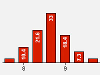
It shows you the percentage of time you spent at each pace during your training run. Each column represents a 20s chunk - so for example, I spent 18.4% of my time running at between 9:00 and 9:20 minutes per mile. Looks like I spent more of my time in the 8:40-9:00 bracket though. It's worth noting that, due to the limitations of GPS, this graph is always a bit wider than reality. However, it can be very useful. On a recent long run, we averaged 11:12/mile, because we had to cross a lot of roads, and take pictures of cute fountains, but the Pace Bands graph showed that we did most of our running in the 10-10:20 bracket, which made us feel a lot better.
A lot of GPS watches also have the ability to measure your heart rate - either through a chest strap, or via a sensor on the back of the watch. Your heart sends oxygenated blood to power your muscles, so the rate that it's pumping is a useful measure of how hard you're working. Your pace on a gravelly hill might be much slower than normal, but your heart rate stats can give a clearer idea of your exertion levels. A noticeably higher heart rate can often be a sign that you're carrying a virus, or that you've been overdoing it.
As well as seeing your pace and heart rate zones for each individual run, you can set your Training Control Panel up to show you an amalgamation of your data - so you can keep an eye on the intensity of your training over a number of weeks. Here's a graph that shows the percentage of time I've spent in each heart rate zone over the last ten weeks:
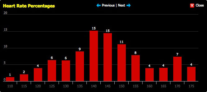
I've been trying to avoid that middle ground around the 160bpm, making sure that I'm either keeping a low heart rate to improve my aerobic fitness, or training at a higher intensity to target my lactate threshold. When I'm not being thoughtful, the two peaks on the graph merge into one.
But plenty of us don't have fancy technology to tell us all of this, and some of us prefer to run by feel in any case. Experienced runners can often give you a pretty good estimate of pace just by assessing how hard they're working.
There have been several attempts to formalise the ways in which we rate our exertion levels. Perhaps the most commonly used is Gunnar Borg's Rate of Perceived Exertion (RPE) scale, which allows users to pick a number representing their exertion level, all the way from 6 (resting), through 13 (somewhat hard), right up to 20 (the zombies are coming, save yourselves). The seemingly odd range (6-20) is designed to be roughly analogous to a typical heart rate e.g. 6 corresponds with 60bpm, 20 corresponds with 200bpm. For ease, the Borg RPE scale is sometimes rewritten as a score between 1 and 10.
In your Training Log, you can now keep a record of the intensity of your training, using the modified Borg RPE scale. View any of the entries in your training log, and you'll see a graph that looks a little bit like this:
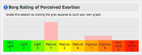
You can build up the columns any way you choose - whatever feels like the best representation of your training session. If you went at it like a bull at a china wholesalers, you can just colour in the '10' column. If you started off easy and increased the effort, you can fill in multiple columns. You don't have to fill a set number of boxes - just so long as the proportion in each column looks right.
Building up a picture of the intensity of your training can help you to see patterns, and can give you a focus. Lots of us look at our weekly mileage totals, but the next step towards a detailed understanding is to measure the total amount of work that we do, and think about the most effective way to distribute that.
Here's an example to set you on your way. Lots of novice runners do all their runs at the same intensity, week after week. If you do 20 miles a week, and you run them all at level 7, let's (crudely) multiply those together to make 140 'intensity points'. Now imagine what would happen if you changed your weekly pattern, so that you ran 16 of those miles at level 6, and the remaining four at level 8. That makes 16x6 + 4x8 = 128 points. The slow easy miles target your aerobic fitness; the shorter sharper miles target your lactate threshold; and the net weekly effort is just a little bit less intense. If you're also able to spread the high intensity stuff out between easier sessions, you allow yourself greater opportunities for recovery too.
Of course, it's a bit of a simplification; you should consult a professional before beginning a programme of exercise; and the value of your house can go up or down. But it's a useful illustration of how to plan your training to maximise your results whilst minimising your efforts. Give it a try.

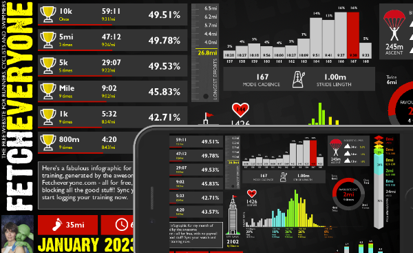
Monthly Summary
A brand new shareable infographic showing a colourful breakdown of your training month.
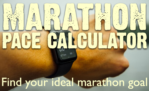
Marathon Prediction
We delve deeper to give you greater insights when working out your goal marathon time.
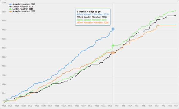
Pre-race Training Analysis
See your accumulated mileage in the weeks leading up to any event in your portfolio, and compare it to your other performances
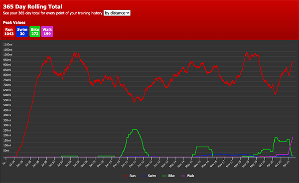
Your 365 Day Totals
Peaks and troughs in training aren't easy to find. Unless you use this graph. Find out what your peak training volume really is
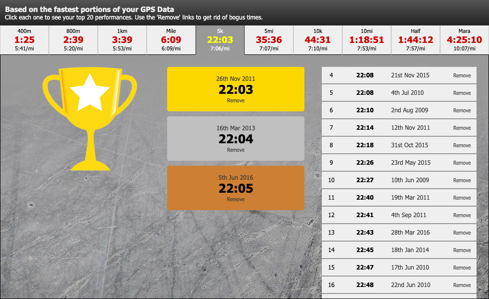
Benchmarks
See the fastest portions from all your training runs. Filter by time to give you recent bests to aim at. Every distance from 400m to marathon.
Fetch Everyone Running Club
Join our UKA-affiliated club for event discounts, London Marathon ballot places, the chance to get funded for coaching qualifications, and a warm feeling inside.
Leave a comment...
-
Helpful, thanks (and now I know how to interpret the pace bands graph. I'd often wondered....)
RevBarbaraG
-
The value of my house can go *down*?? WT??
 Good article as ever Ian. Polarized training anyone?
  G
G
HappyG(rrr)
-
Sorry I understood most of it but some of the descriptions left me confused

snogard
-
Which ones snogard?
fetcheveryone
-
Another great article, top work, Fetch

-x-x-
-
I thought the Borg bit was a Star Trek reference...
cackleberry
-
OK - but someone who logs a 1m WU / 3m tempo / 1m WD as one 5m entry should probably realise all the functionality they're missing by doing that first of all, rather than trying to retro-fit Borg rating.
paul the builder
-
I prefer to think that it gives everyone the flexibility to do what they like.
fetcheveryone
-
Very good reading.
Rosielad
-
Have to say I'm a bit sceptical; in what sense is slowing down and taking it easy 'working on your aerobic fitness'? I'd call that junk mileage. Out can be useful if you are working on distance of course but then you would be wanting to go at an easy pace but long. You have to push some system out of its comfort zone to make it adapt. Sorry to carp....
Le Grand Bâtard de Bourgogne
-
Can someone help me please. I can't see where the Borg RPE scale is in the training log. Thanks
milemonster
-
Click the glasses next to a run in the list, and it's on that page.
fetcheveryone
-
Le Grand Btard de Bourgogne - have a read of this one for my thoughts on that: http://www.fetcheveryone.com/cms-63
fetcheveryone
-
I'm very much the runner of novice pace. But now the lovely cool winter training is stating I'm gonna give it a try.... Watch this space

Blades rio
-
This is a very useful idea. I will try to use it in my traing for MK Marathon next May.
Ambling Andrew
-
how do i fill in the intensity info? I clicked on it on a run I had entered this morning but it wouldnt let me overtype the numbers. If i tried to amend the entry itself I couldnt find intensity noted on there. thank you.
Crazy Lady
-
Click on the little grey boxes above the numbers.
fetcheveryone
-
I see. Twin peaks is good. Thanks for explaining. Can the next story be about lactate threshold please?
Wazelle the Gazelle
To comment, you need to sign in or sign up!I quite like this, perceived effort is a funny thing. I've had really crap runs where my average pace wasn't much faster than a walk, but I really couldn't have done any more. That gets a '9'.
I look forward to playing with graphs!
Especially as I aim to do most of my runs off road, so miles/time not that good a reflection of how hard I have worked. Hills slow me down as does MUD!